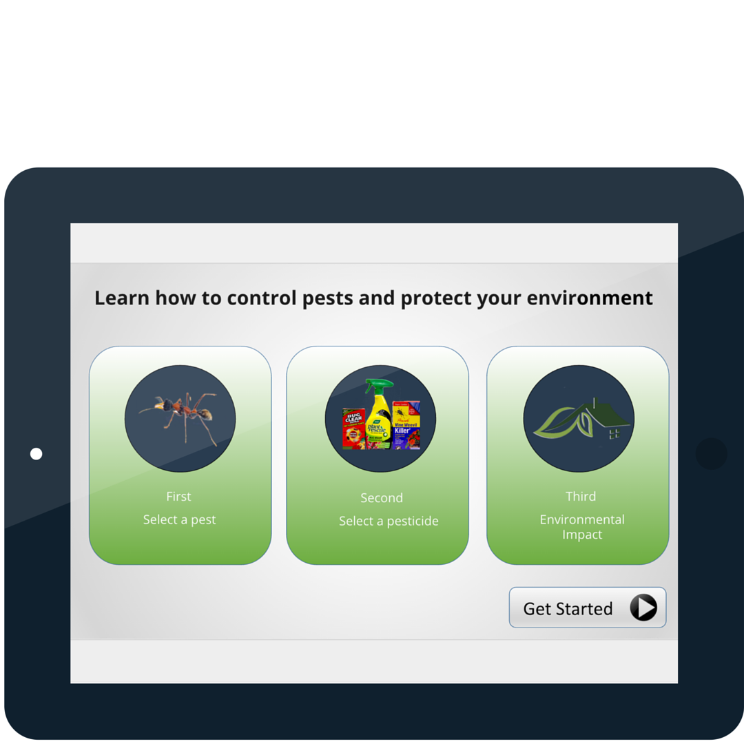
Scroll down or
click on a tablet for more information.

Scroll down or
click on a tablet for more information.
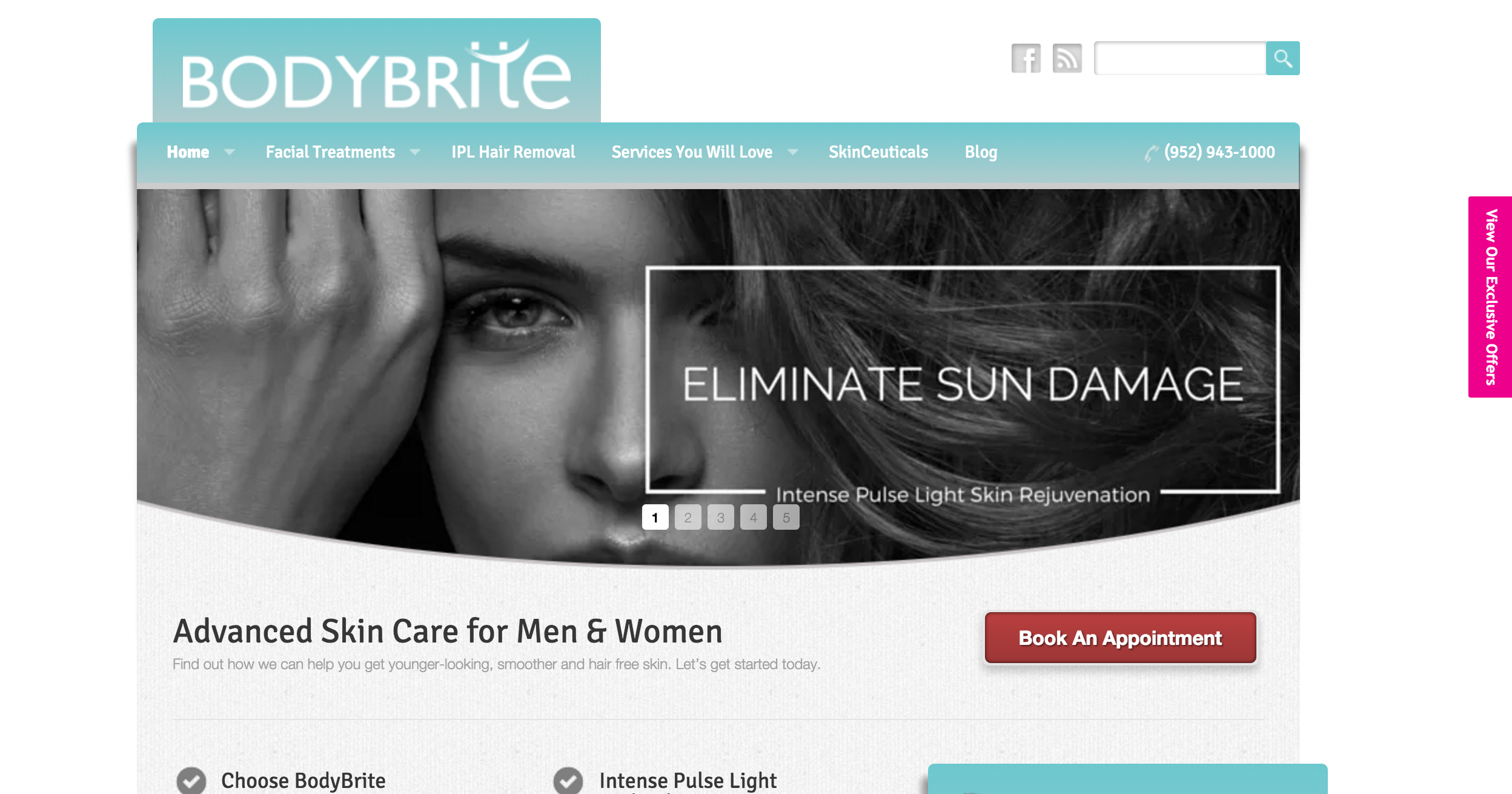
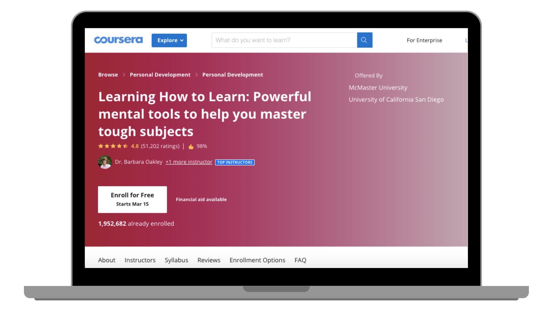
Your website homepage is the first impression for many if not most of your future users. Creating an inviting experience to welcome folks, show value, and take action is critical to your company success. Below is the case study for updating Coursera’s website in 2019.
Coursera’s qualitative “story” update to the homepage 2019
At Coursera, the existing homepage had not been revamped in many years, during which time siloed growth and marketing teams had tacked on new features according to their needs at the time. This eroded the original vision and story of Coursera. Attempts to update the homepage were started and scrapped again and again and teams could not align on a single story for the page.
In addition, user research showed new learners did not understand what the company did or what types of programs you could learn on the platform. In fact, many learners were surprised and delighted by the depth and breadth of what was offered once it was explained - a huge gap to attract different learner segments. Several UX hotspots were also identified.
Despite these issues, the homepage was the first interaction with Coursera for a majority of visitors as well as the single page with the attributing to the highest number of new learners as well as driving a majority of the Coursera for Business new leads. Improvements to the homepage could thus have a huge impact on all business lines.
As Growth leader Brian Balfour at Reforge has said, if your users forms “a great first impression you have tons of opportunity to leverage that into long-term retention and habits.”
We tackled the homepage in three main phases: alignment, functional update, story (qualitative) update.
Phase 1 was the alignment phase. Given the past problems coming together as a single team, it was imperative cross-functional stakeholders were aligned - product, data science, engineering, design, user research, marketing, partnerships, sales, and more. Having leads in marketing, design, user research, and product focus on areas such as competitive research, past test results and research, as well as design principles of current and past homepages allowed us focus the conversation on key aspects of the page. Creating a time box for critical discussions - such as the goals and success metrics - ensured that we came to a conclusion at the end of the discussion. Another win was pulling in stakeholders across all impacted business lines (which was most of the company) to ensure we weren’t missing critical insight and had buy-in on timelines and goals.
Phase 2 was the functional testing phase. Here we focused on pieces of the homepage that directly led to a user taking an action. This included the CTAs, footer links, and hero navigation. By focusing on the areas that drove action, we could isolate parts of the page and run smaller tests in order to understand the impact of the features. We ended up with many learnings on types of photos to use, language and more.
Phase 3 was the story (qualitative) update. While driving registration or discovery was critical to our business success, we had a hypothesis that telling the story of what Coursera is and what it could do for new learners was key. By keeping this “story” test separate from our CTA test we could add a numerical value to what this story represented to the business. After two rounds of user research and many rounds of internal feedback, came up with three different variants which added or subtracted elements of the story in order to see what was most effective. We were surprised and delighted to find out that the original and longest story was also most effective.
Our updates improved annual registrations numbers by over 4% (over 12% relative), with the greatest impact coming from updates to the mobile CTA and adding the qualitative story.
With a homepage that impacted the entire business, we received an incredible amount of feedback from key stakeholders and executives. By implementing Asana’s “Do, Try, Consider” feedback framework we were able to easily digest the feedback on what was something we MUST do vs. something we should think over and discard as we saw fit.
I strategize using UI/ UX design best practices, user research, a grounding in behavioral science, combined with conversion analytics to help my clients effectively communicate with their current and future customers. Scroll below for examples of web design, content marketing and basic design skills.
I work with my clients to balance the look and feel of their brand and continually optimize for conversions. I help my clients create clickable interfaces with proven metrics to help obtain their goals. My website designs are backed by SEO keyword and on-page optimization for conversion. I have designed in Squarespace, WordPress, Wix, Shopify, Weebly, and many more.
Creating compelling content marketing is an art-form and science for conversions and lead nurturing. My expertise in automated marketing adds rocket engines behind well-crafted emails. I help my client create personalized, delivery optimization, targeted email marketing sent at the right time to the right person.
It's important to communicate to your customers in the space they feel comfortable. I help my clients, both large and small, adapt to omni-channel marketing in the digital age.
Need a quick design? My design skills with Photoshop, Illustrator, Canva.com, and pagemodo.com will get the job done with the correct standards needed for the channel you are using.
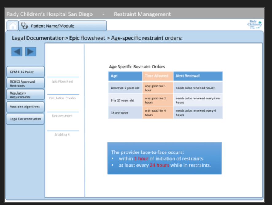
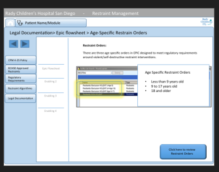
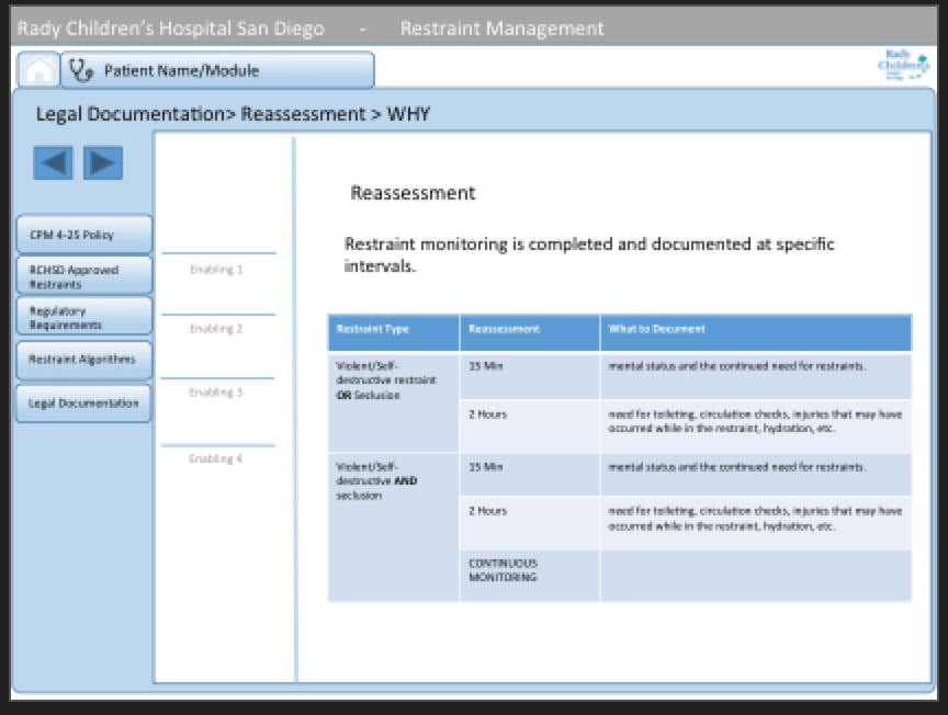
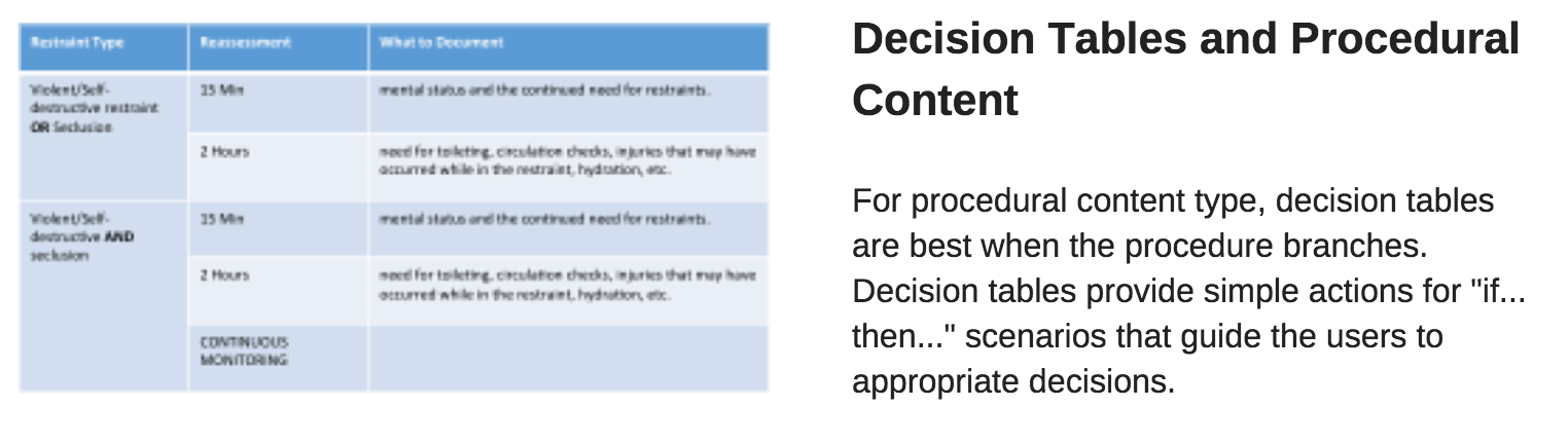
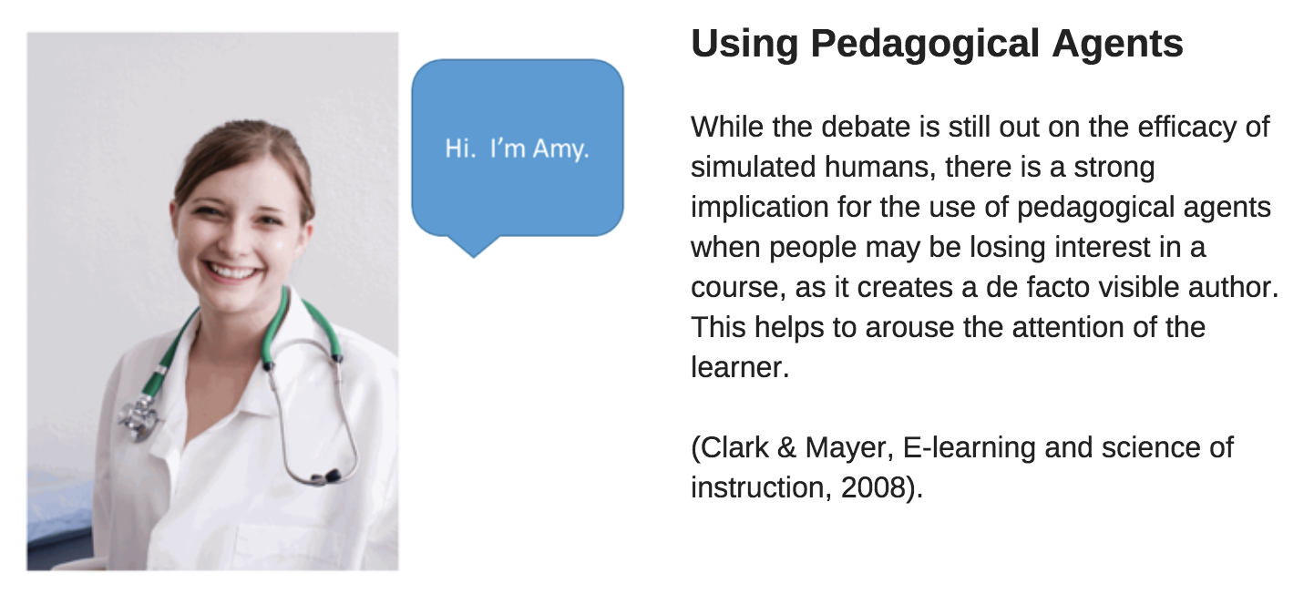
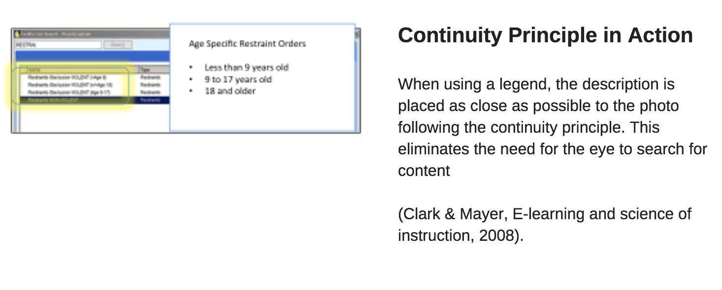
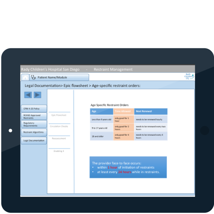
My instructional design class at San Diego State University was selected to create a online course to teach patient safety for health care safety credentialing. These are mock-ups of the 200 slide project my team submitted. The instructional method for Far Transfer knowledge is through hands on experience. Without that option, online simulation and testing were the next best option. To simulate the working environment, we based our design on the EPIC electronic healthcare records our users accessed on a daily basis.
Other design considerations included:
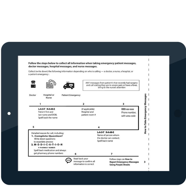
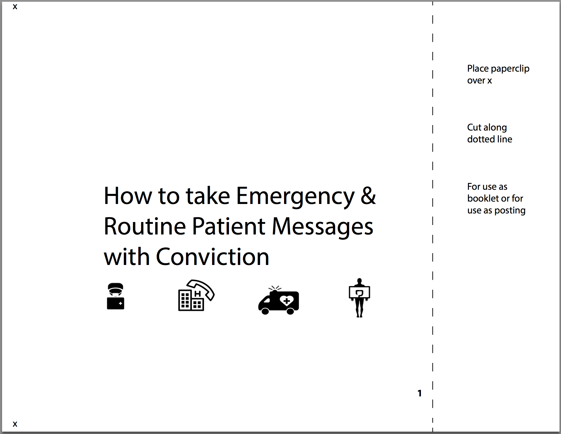
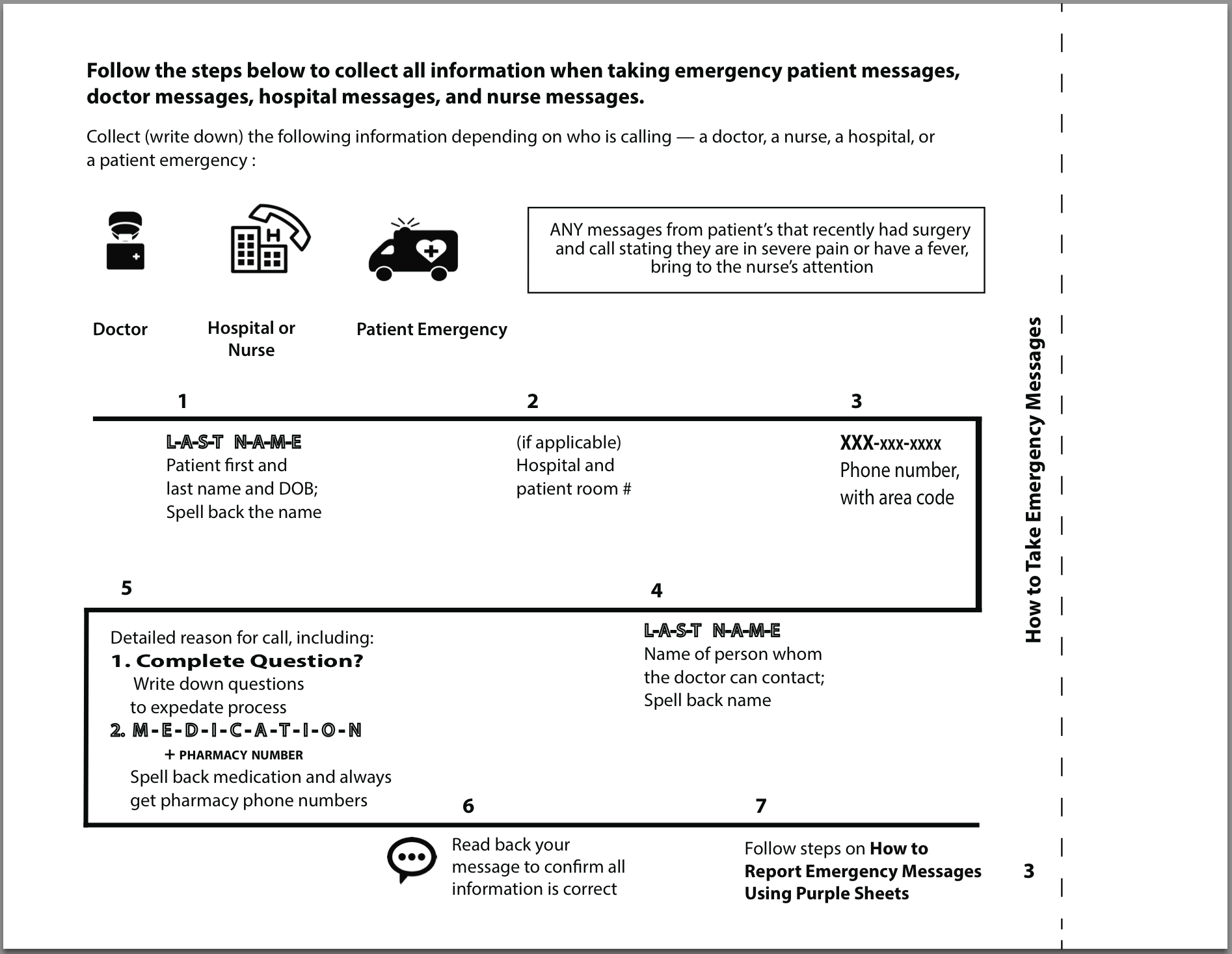
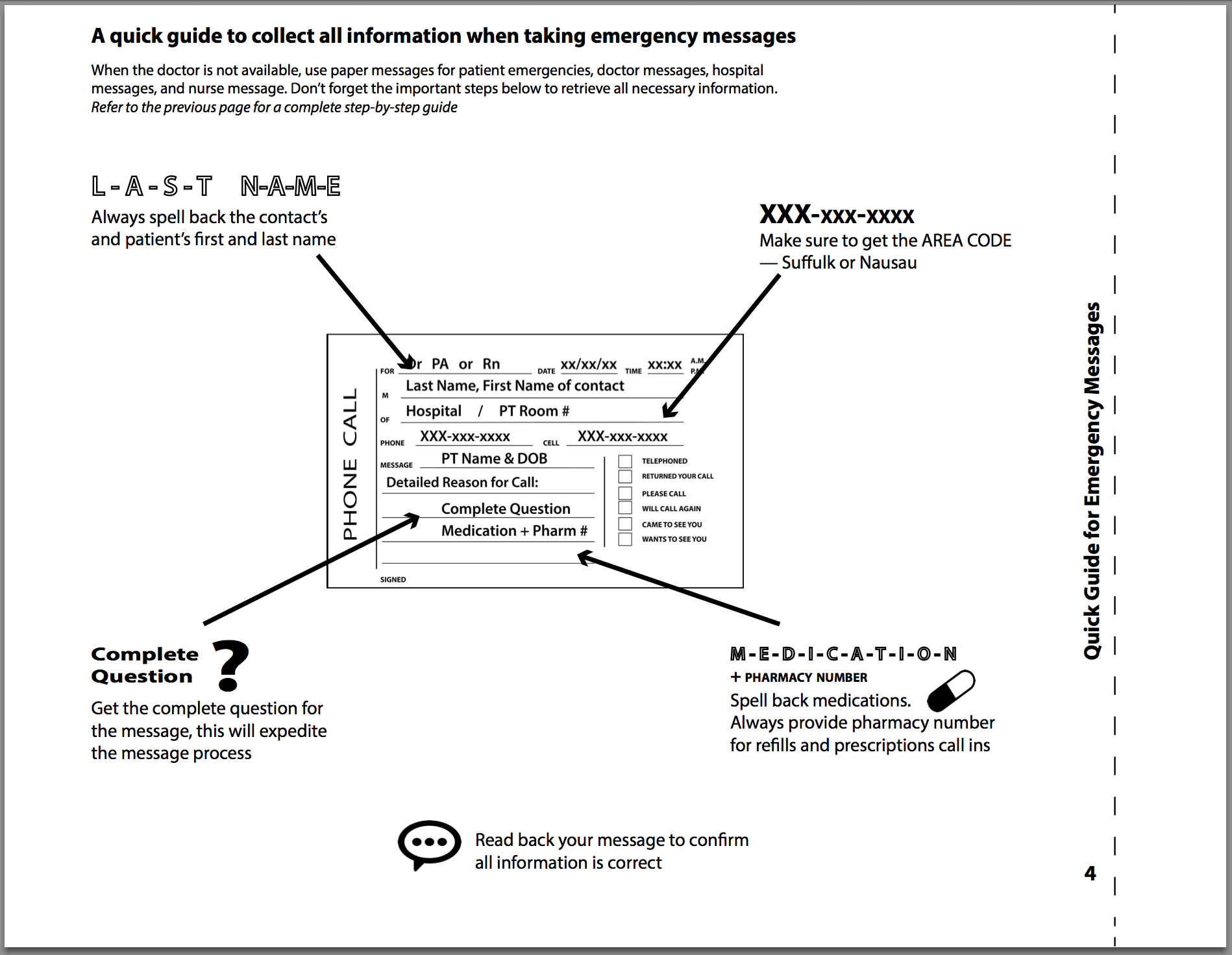
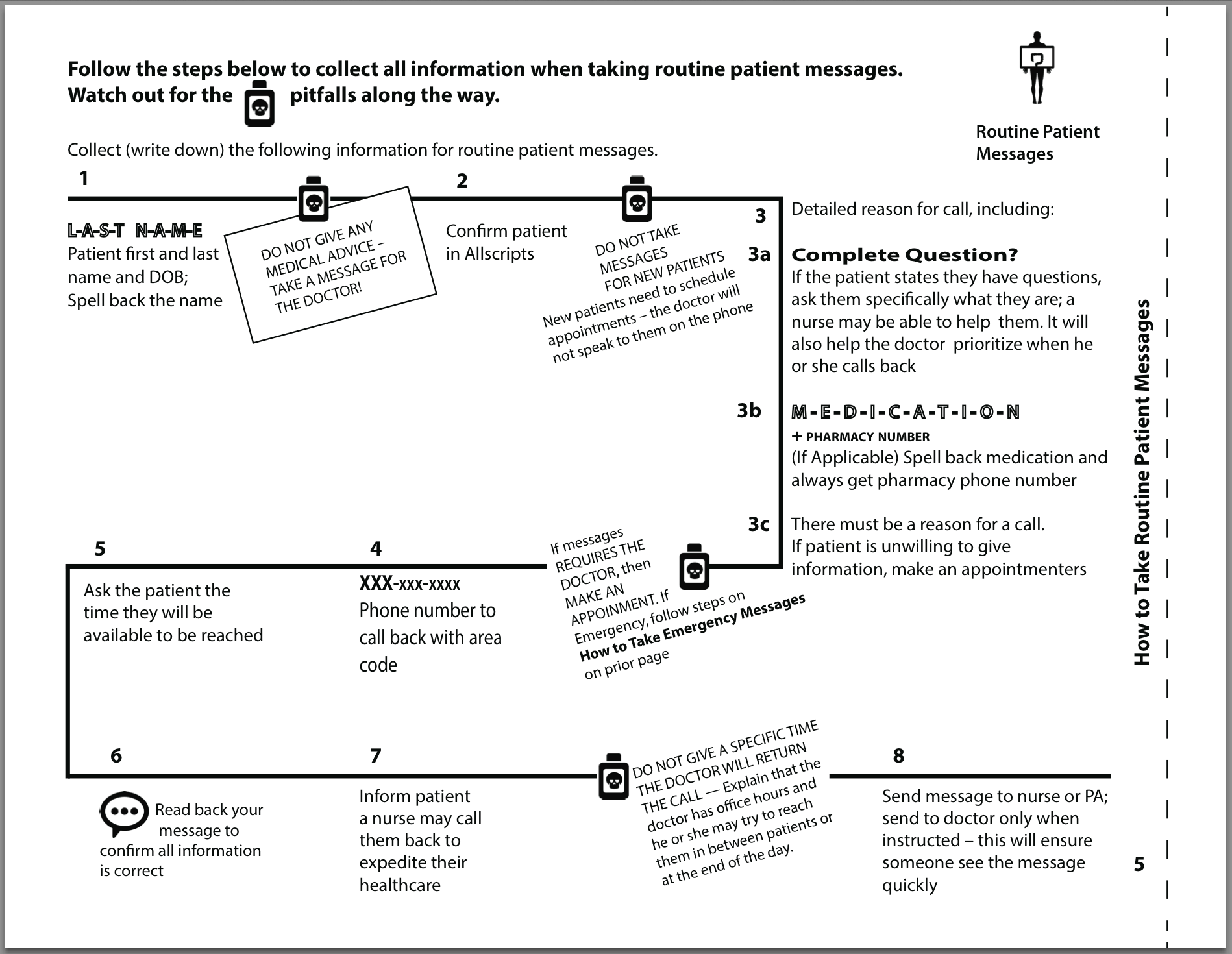
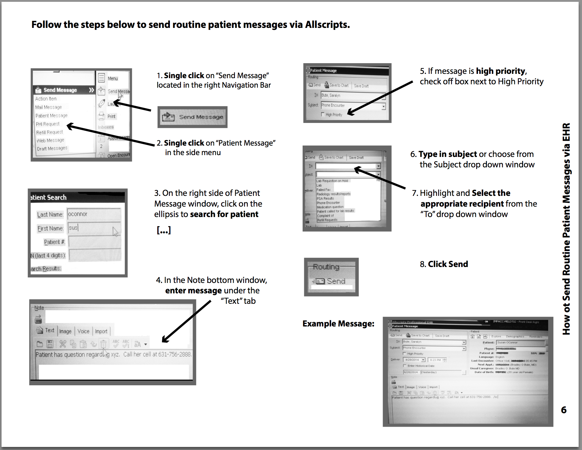
While taking notes may seem like an everyday task, the necessary information for each type of message differs from one business vertical ton the next. In healthcare, this information saves lives. Many small omissions in information, such as the proper spelling of a last name or a pharmacy number, wasted an estimated 948–1300 hours a year of the manager and doctor’s time looking for necessary information. This is costing the company approximately $33,400 – $54,600 annually or $334,000 – $546,000 over ten years.
By providing a step-by-step procedure in an easily digestible and memorable way, receptionists need only remember where information is stored in the job aid to take a complete, error-free phone message. In the CDT model, this is a remember procedure job aid.
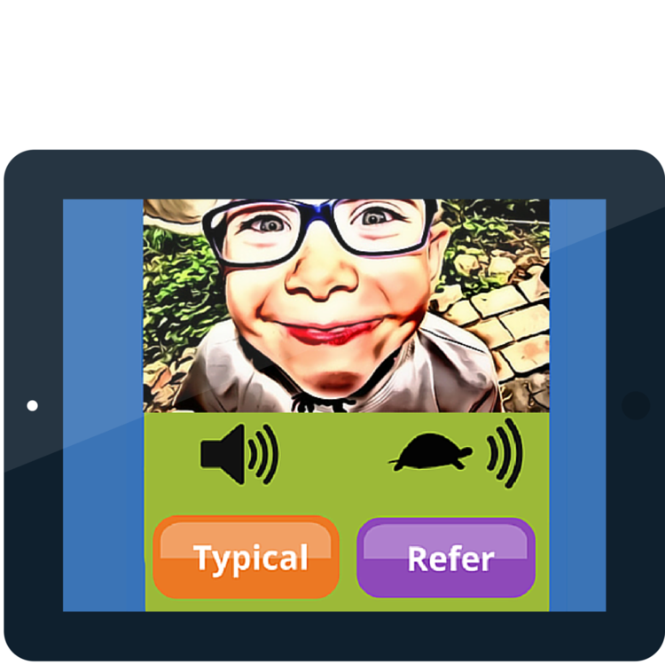
No two children are alike and no child will develop at the exact same rate as another. Knowing the child development milestones is key in recognizing when there is a problem and is very important for early intervention. According the the American Speech–Language–Hearing Association (ASHA), 64% of parents are unaware of early warning signs. The ability to properly refer a child to therapy is in the best interest of the child.
With the Identify the Signs game, parents and child-care professionals will learn the signs of typical progression and signs that need referral. Players will listen to a child’s speech in an environment where they can replay until they are comfortable making the decision on whether or not the child needs to be referred to speech or language therapy.
Sample Intermediate Level Play
Evidence-Based Design Elements:
We incorporated the Self-Explanation Principle for Games in our prototype. This principle states that people learn better from games when they are asked to provide an explanations for their actions.
Research conducted by Cheryl Johnson and Richard Mayer (2010) determined that a possible boundary condition is that the rules remains as un-intrusive as possible. During the study, students performed better when they selected the correct reason for making the choices from a drop down menu as compared with students who typed in their explanation in an on-screen text box. Johnson and Mayer propose this increases deeper reflection on the academic content, or generative knowledge.
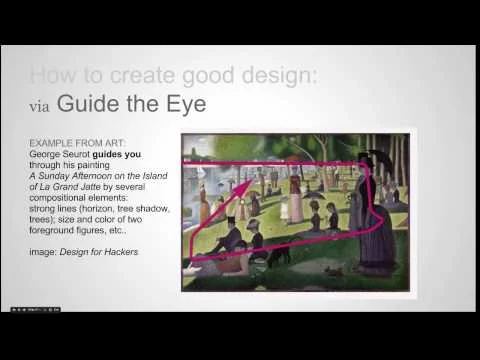
This project focuses on the best practices in compositional design conveyed through online video medium. Good composition is based on attracting the viewers eye and engaging the viewer by guiding the eye throughout the material. A screencast is a video record of a desktop or mobile screen, often with audio or text overlay.
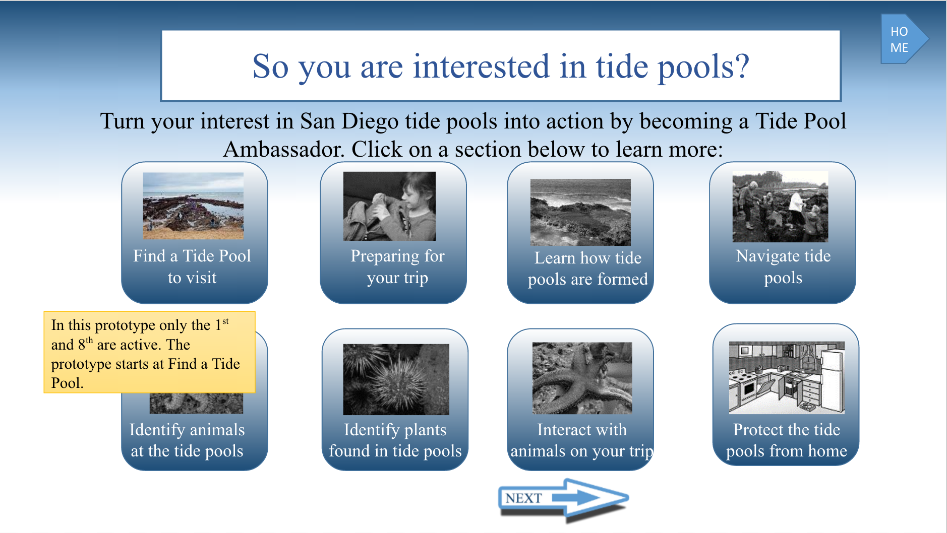
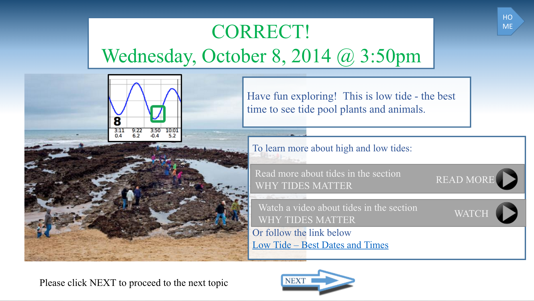
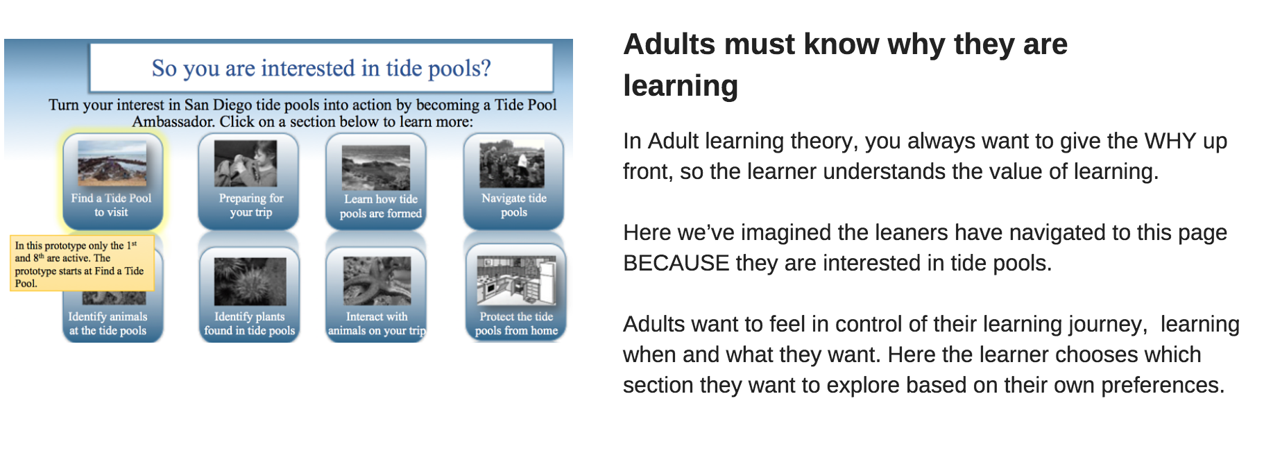
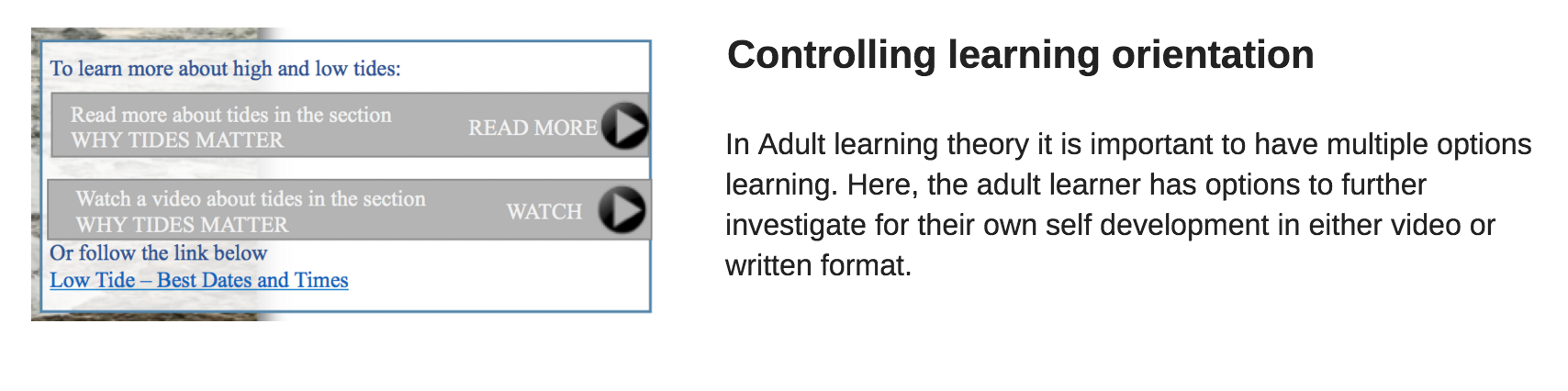
The theory of adult learning or Andragogy (coined by Malcolm Knowles), focuses on best practices for adults to learn. Key points include: adults must know why they are learning; adults must feel in control of their learning; learning must relate to the adult's own experience; the adult learner needs readiness to learn.
My team applied the andragogy best practices to the creation of a learning portal about San Diego Tide Pools.